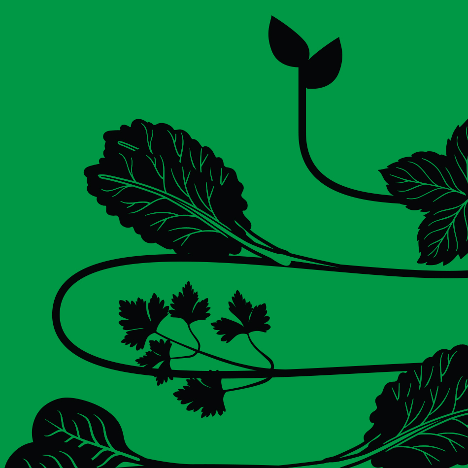
Find me on social media

LinkedIn
Instagram
Pinterest

Postigo Homes

Create branding for an Amsterdam based home renovation company. The idea behind the logo icon came from the meaning of POSTIGO, “A smaller door within a larger one”. This smaller door being opened inwards is represented by the negative space / light within the larger surrounding area....

SlowleeSlowlee Brand Identity

SlowleeSlowlee is derived from the Swahili expression “pole pole”, which means slowly slowly. The SlowleeSlowlee philosophy is to take life step-by-step, to gradually build, to understand that the journey takes time, and at the same time to understand that the only thing we have is time. The company approached us to create an identity for the product and ideas that capture/promote daily digital detox. A house style that should be timeless, appeal to many ages, gender-neutral...

Burlington Labeling Relaunch

Unisex modern clean approach with a touch of fun approach that reflects the brands young fashionable boutique positioning. Look and feel luxurious using matt silk soft touch materials and holographic foil stamp. Concept is implemented to all labeling items and for the sports category simply replaced the foil treatment with neon in order to make a clear distinction between the two categories....